Client

Communication Leadership Consulting connects small organizations (clients) with motivated graduate students (consultants) to solve customer engagement challenges.
Communication Leadership Consulting, University of Washington
A website redesign that streamlined access to affordable communications support for mission-driven organizations
Communication Leadership Consulting, a University of Washington program connecting graduate students with small organizations, needed a website redesign to support rapid growth. As the UX Designer, I led the complete transformation from research through launch, creating an intuitive, scalable platform that serves both student consultants and clients seeking communication expertise.
Role
Lead Designer
year
2024
team
Project Managers: Alex Stonehill, Susan Maclaren
Web Developer: Nick Myers

context
The consultancy was growing rapidly, increasing demand for its services.
-
Founded in 2019 as a response to COVID-19, the consultancy was expanding faster than ever.
-
More local organizations and graduate students sought its services.
Despite growing demand, the consultancy’s website failed to convert visitors into clients.
-
Potential clients contacted staff directly to verify the organization's legitimacy and offerings.
-
Most leads came through personal or community connections and very few came organically through website.
Following the Double Diamond methodology to ensure thorough problem definition before jumping to solutions

USER Research
Uncovering critical usability barriers through user interviews and testing
Through systematic research, I identified three key issues preventing website conversions despite the consultancy's growing success.
Research methods
Current State Evaluation, Website Audit, Usability Testing, User Interviews
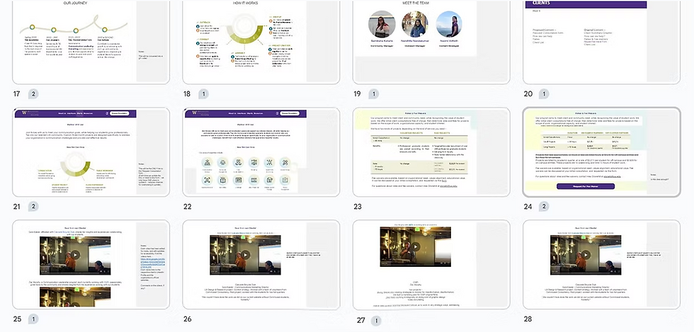
Current state evaluation: (previous) website overview


Screenshots of Website Audit Sheets

Screenshots of User Research Report
Key user pain points
#1 Misaligned Mental Models Create Navigation Frustration
Users expected intuitive navigation but encountered illogical categorization, taking 2-3x longer to complete tasks.
#2 Inconsistent Branding Erodes Trust
Participants questioned the consultancy's UW affiliation due to inconsistent visual identity, directly impacting credibility. Users frequently requested additional verification before engaging.
#3 Unclear Value Proposition Hinders Conversion
Users struggled to understand impact due to lack of social proof, creating conversion hesitation.
Design Strategy
My design strategy focused on three core principles to address user pain points and drive business results.
Design for mental models, not site maps
Structure information based on how users think, not how the organization is organized internally.
Familiarity builds trust
Leverage existing user knowledge and established design patterns to create immediate comfort and credibility.
Show, don't tell value
Use concrete examples and social proof to demonstrate impact rather than relying on abstract descriptions.
Screenshots of Content Strategy & Collaboration with team
Design solution
My solutions directly addressed each identified problem through strategic design interventions that prioritized user needs while supporting business growth.
Design solution #1
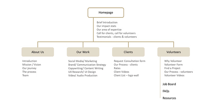
Information Architecture redesign to align with user mental models
Addressing: Misaligned Mental Models Create Navigation Frustration
Restructured site navigation and content categorization to align with user mental models, reducing task completion time by 65%. Reorganized content based on card sorting insights, added breadcrumb navigation and interactive dropdowns, and created intuitive user flows that matched natural information-seeking behaviors.
Design solution #2
Design System implementation to leverage user familiarity
Addressing: Inconsistent Branding Erodes Trust
Implemented University of Washington's official design system to create visual consistency and leverage user familiarity with UW digital properties. Applied consistent visual identity across all touchpoints and used recognizable design patterns to eliminate user confusion about UW affiliation while establishing immediate credibility.
Snapshot of UW’s Design System

Information Architecture & Content Categorization

Design solution #3
Strategic trust-building elements
Addressing: Unclear Value Proposition Hinders Conversion
Built trust through strategic credibility signals placed throughout the user journey. Added above-the-fold impact metrics and clear CTAs to the homepage, strategically placed client video testimonials at key decision points, and created a comprehensive "Our Work" showcase page with detailed examples, resulting in resulting in significantly more qualified leads and fewer time-consuming verification calls.
Paper wire frames for the new 'Our Work' page

Strategically placed client video testimonials at key decision points

Additional Enhancements
Strategic UX Writing
Led collaborative content strategy sessions to define clear, compelling mission and vision statements that reduce user confusion and build confidence in the consultancy's expertise, ensuring scalable messaging that aligns teams and sets proper client expectations.
Visual Communication Elements
Added animated counter-up timer to create engaging proof of impact that captures attention and builds credibility, plus infographics explaining "Our Process" and "Our Journey" that reduce cognitive load by transforming complex information into easily digestible visual narratives.

Brainstorming notes with the team for rewriting Mission & Vision Statements

Enahncing Visual Impact using animated infographics

“The new website didn't just look better - it completely changed how we acquire clients. We went from chasing referrals to having qualified leads come to us.”
-- Outreach Manager, Communication Leadership Consulting
Impact & Results
The redesign transformed the consultancy's digital presence from a conversion barrier into a growth driver.
-
60% improvement in form completion: Streamlined user flows eliminated friction points, making it significantly easier for potential clients to take action
-
2-3x faster task completion: Users experienced significantly reduced cognitive load. They could find information and complete actions much more efficiently.
-
34% increase in user engagement: Enhanced content strategy and intuitive navigation kept visitors exploring longer and diving deeper into services
-
30% reduction in bounce rates: Improved first impressions and clearer value propositions successfully retained more visitors
-
50% fewer direct staff outreach requests: The website now effectively handles routine inquiries, freeing up team resources for high-value client work
The redesign shifted the consultancy from relying on word-of-mouth referrals to generating organic leads through their website, enabling sustainable growth.
The before and after comparisons below visually demonstrate how strategic design decisions directly contributed to these measurable outcomes.


Reflection
This project was particularly meaningful as I had been closely involved with the consultancy long before taking on the redesign. Witnessing their rapid growth and the frustration users experienced with the existing site, I felt a strong responsibility to create something that truly served both the organization and its community.
The challenge wasn't just technical - it was about understanding how design decisions could either support or hinder an organization's mission. Working on this project reinforced my belief that sustainable UX design requires thinking beyond individual features to create systems that grow with the organization.
Key Takeaways for
UX Practitioners
Trust is built through design
Consistent visual identity and social proof elements signal credibility
Small details create big impact
Simple improvements like breadcrumbs and testimonials significantly enhanced usability
Designing for scalability enables sustainable growth
Built flexible content systems and clear information architecture that support the consultancy's rapid expansion.
Want to work together? Let's connect and discuss how strategic UX design can drive your business results!

Ready to collaborate?
If you're looking for someone to tackle complex UX challenges or lead accessible design initiatives, let's connect and make meaningful impact together.